These are hand flags with the disability pride flag on them, designed by Ann MacGill, a disabled artist who collaborated with the community in the process. She's asked that it be used widely and freely and put it in public domain.
This is the symbolism:
"The Black Field: Represents our mourning for those of us (disabled people) who have suffered, lost their lives from Ableist violence, negligence, suicide and/ or eugenics.
The Parallel Stripes: These represent solidarity within the Disability Community, despite our differences. The Diagonal is intended to be in contrast to the vertical walls and horizontal ceilings that isolate us.
The Five Colors: These colors represent the diversity within disability and our experiences (Mental Illness, Neurodiversity, Invisible and Undiagnosed Disabilities, Physical Disability, and Sensory Disabilities). The colors stand for:
The Red Stripe: Bodily disability (mobility impairment, limb difference, chronic pain/fatigue, etc).
The Gold Stripe: Neurodiversity (Autism, ADHD, Dyslexia, Dysgraphia, etc)
The White/Silver Stripe: Invisible disabilities, and undiagnosed disabilities.
The Blue Stripe: Emotional and Psychiatric Disabilities (Depression, Anxiety, Bipolar Disorder, BPD, NPD etc).
The Green Stripe: Sensory Disabilities (including sensory processing disorders)
This explanation quotes and paraphrases from the two links below:
1) Reddit thread written by Ann Macgill herself. She specifies that while neurodiversity does include psychiatric disabilities, everyone identifies differently and having both Blue and Gold stripes is more inclusive.
2) A summary by Meriah Nichols, a disability justice educator.
There are two variants of this hand flag because the original muted palette was intentionally designed to be visually safe, particularly for online use, by helping reduce migraine and seizure triggers. The brighter palette emerged through the printing process, and some community members preferred this version, so I wanted to offer both.
In a Reddit thread discussing the flag, Ann Magill mentions that some people who experienced issues with the brighter palette digitally did not notice the same concerns when interacting with the flag as tangible media.
I want these flags to remain accessible within community spaces. Community and bulk pricing is available for bookstores, nonprofits, Pride events, classrooms, and mutual aid distribution. Please contact me directly to discuss options
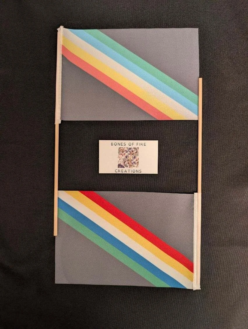 Image 1 of 6
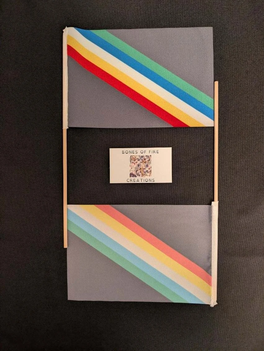 Image 2 of 6
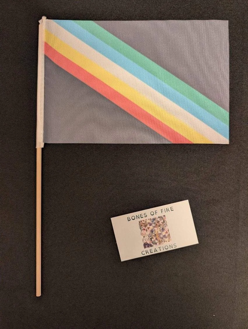 Image 3 of 6
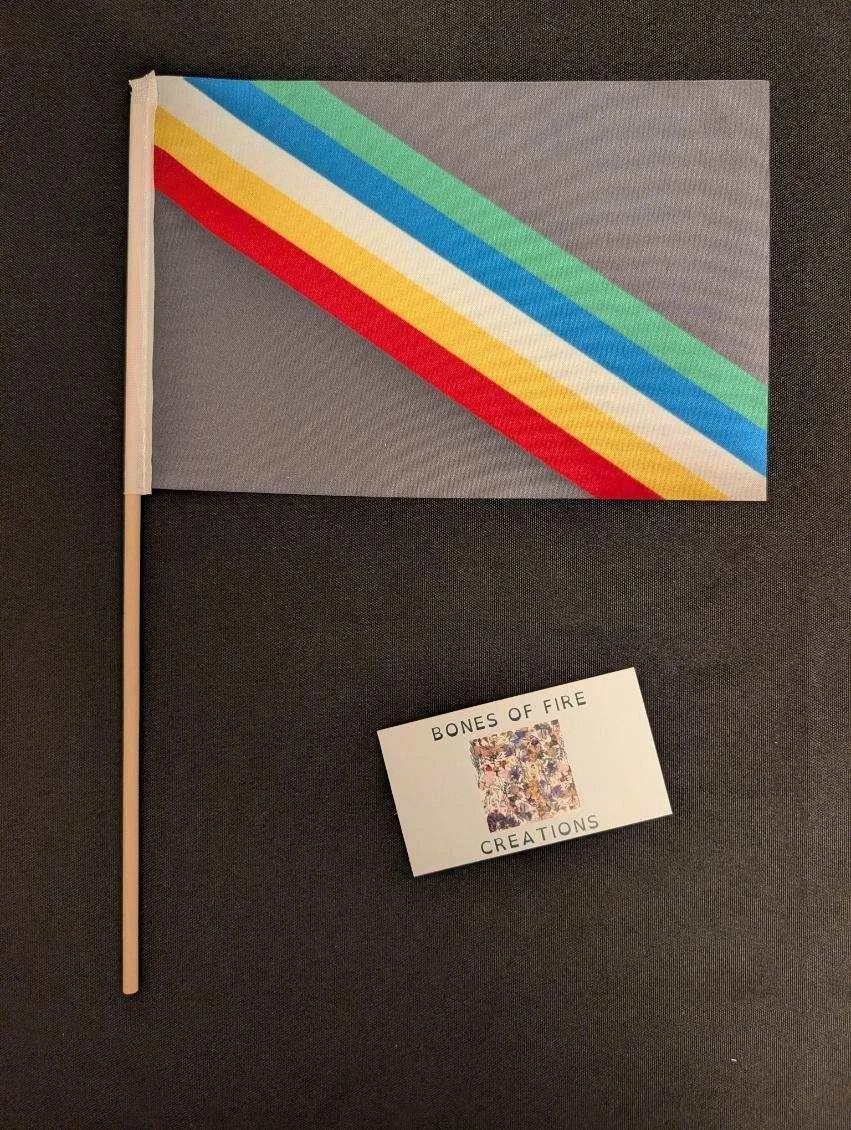 Image 4 of 6
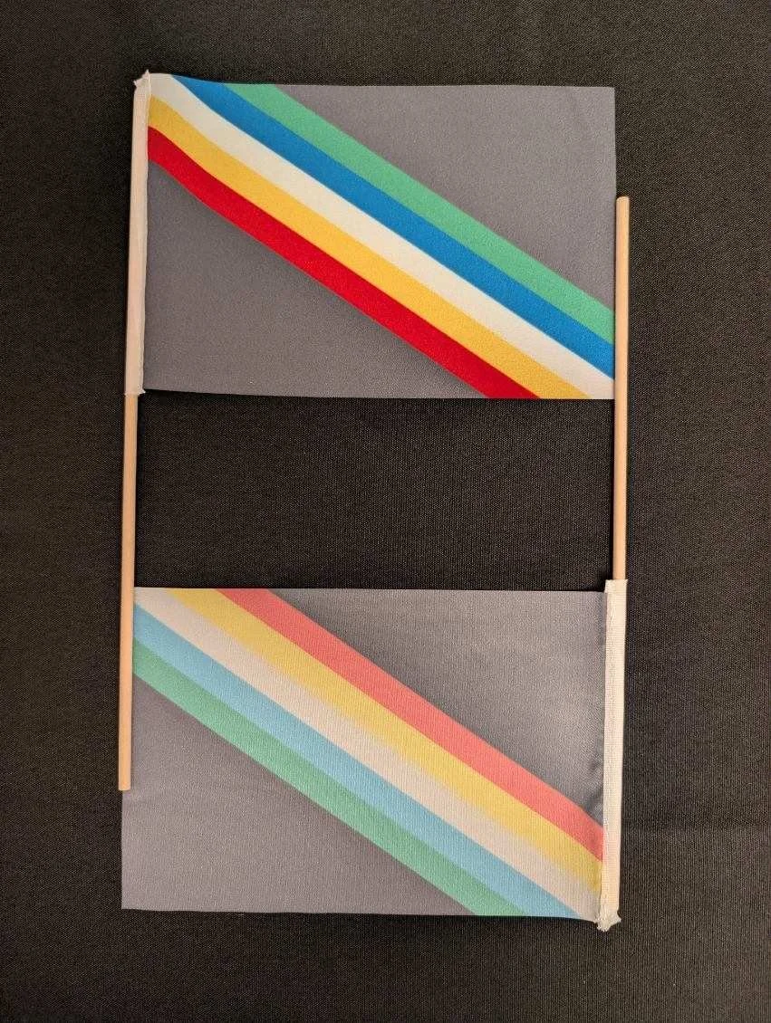 Image 5 of 6
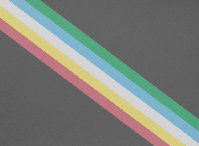 Image 6 of 6